The Plate: Redefining agricultural perceptions
The Plate is a digital media platform that makes stories from India’s farmlands accessible and compelling. The project bridges a crucial gap with a design approach rooted in empathy, storytelling, and sustainability.
Timeline: 6 months
Role: Product Positioning, brand identity, qualitative user research, wireframes, website, style guide
Tools: Figma, Miro, Microsoft Suite
x
What are we talking about?
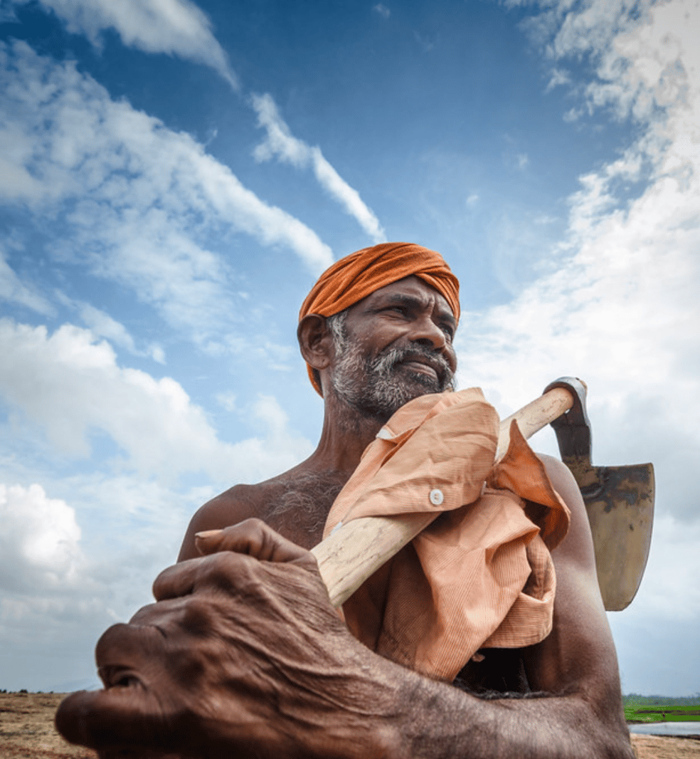
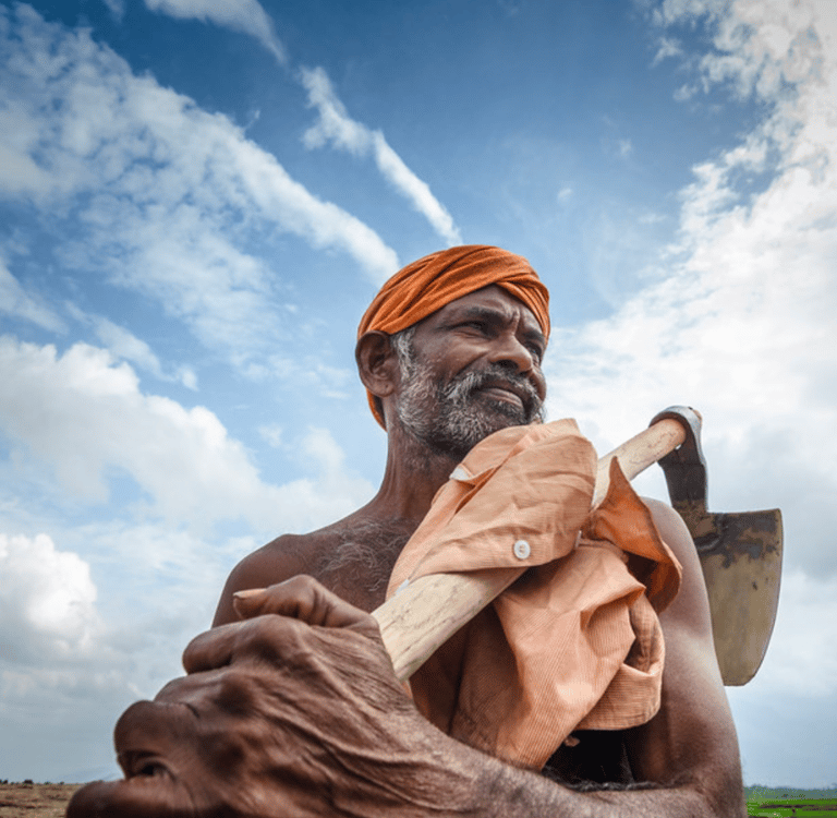
Farming in India, like most other countries, has existed since the dawn of time. India has always been an agrarian economy. But… “Never in the field of Indian journalism was so little written about a business so vital to sustaining life." Content is created and curated for experts by experts. It often involves complex scientific data and jargon that the average farmer or consumer does not easily understand. Further, it is usually published in journals or presented at conferences, making it inaccessible.
The Goal.
Indian agriculture has a PR problem, disconnecting urban consumers and food producers. We need to change this by bringing consumers closer to their food and their farmers.
Deliverables: Research & Design
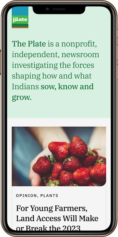
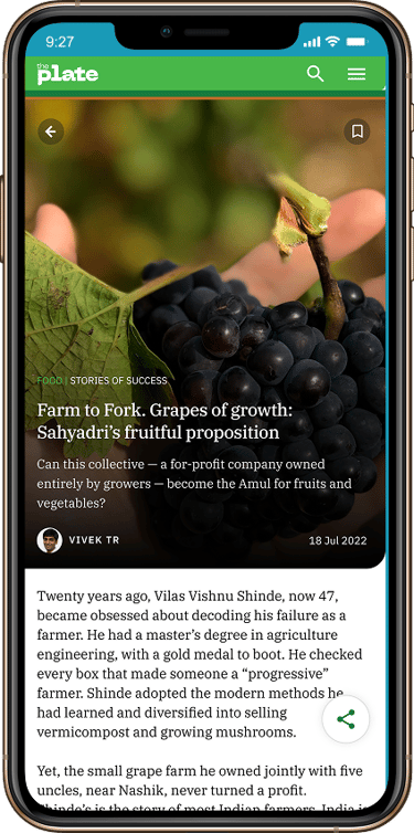
User Facing Mobile App
Desktop Translation
Static Corporate Website
Farm
Plate
Point of intervention: The Media
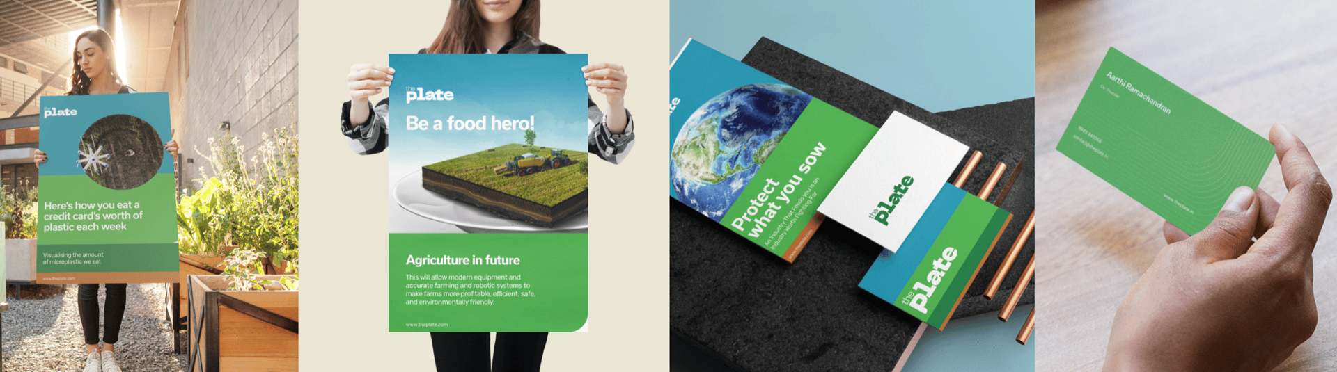
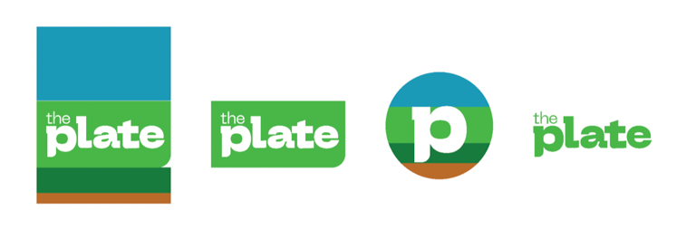
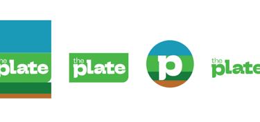
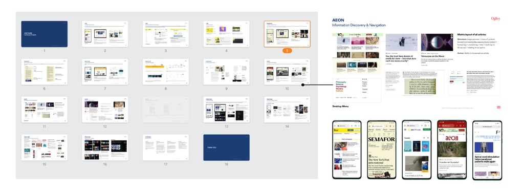
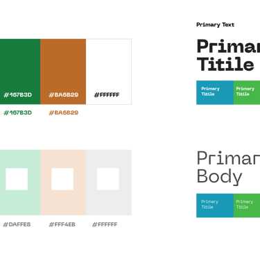
The Brand:
Inspired by Mark Rothko’s paintings and drone shots of agricultural lands.
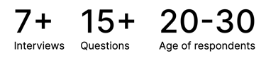
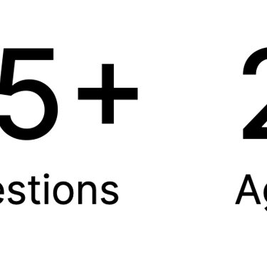
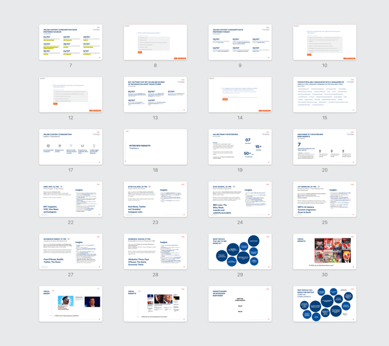
Qualitative Research:
Purpose: To understand, in depth, peoples’ content consumption patterns. How the design, language and media presented can impact people’s views. To get insights on why they choose what they choose.
Audience?
The study of 5 digital magazines was done in order to understand their UX strategy, Branding, Categorisation on Desktop, Mobile and Social Media.
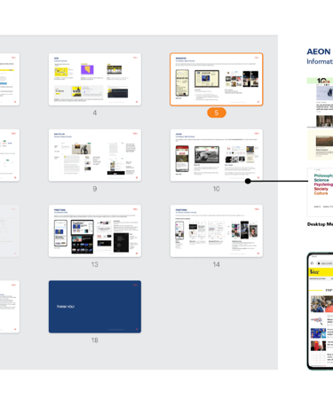
Landscape Analysis.
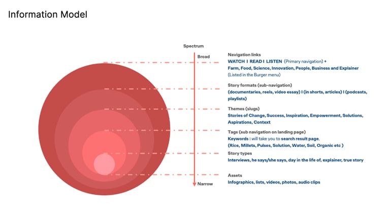
Information Model:
Content prioritised based on user habits and ease of access.
Wireframes to visual design.
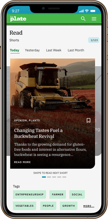
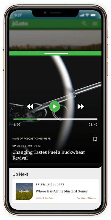
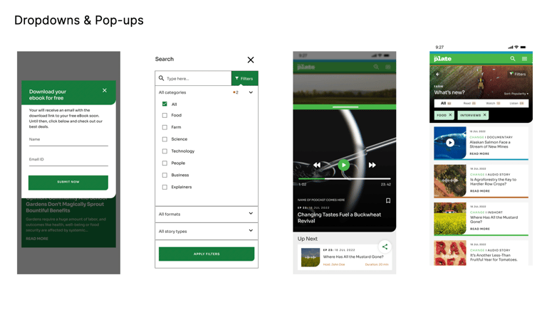
Exploring interactions: In order to make each article readable and scannable, I explored a horizontal swipe interaction instead of a long vertical scroll. The intent was to make moving across the articles as similar as possible to the natural reading experience.
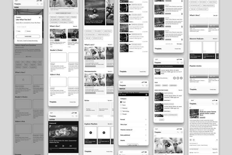
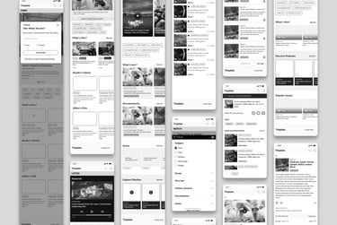
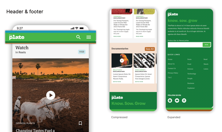
Menu, navigation & hierarchy.
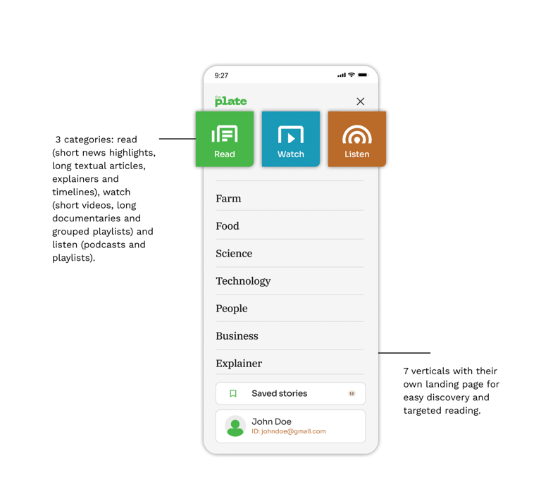
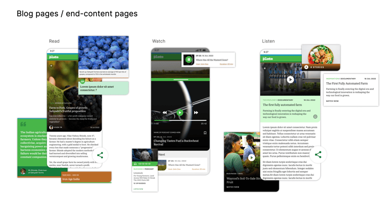
A multitude of story formats designed for all types of readers.
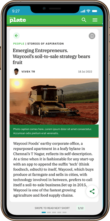
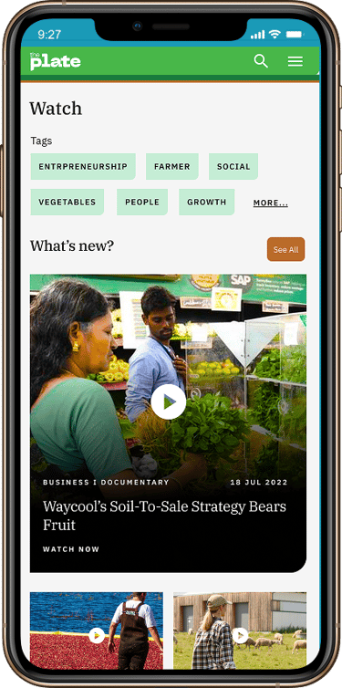
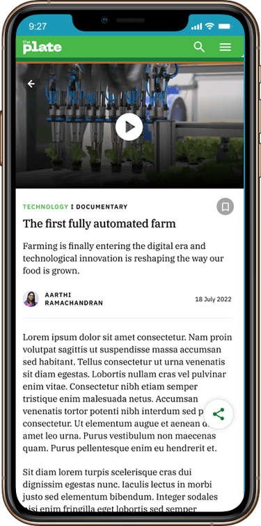
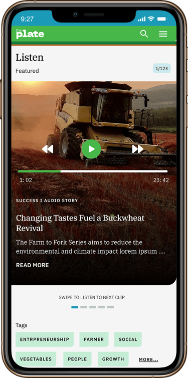
Various story formats were designed individually with the intent to make them as compelling and lucid as possible for both, people looking for short-reads and those looking for research material.
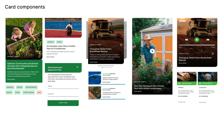
Design system and card components